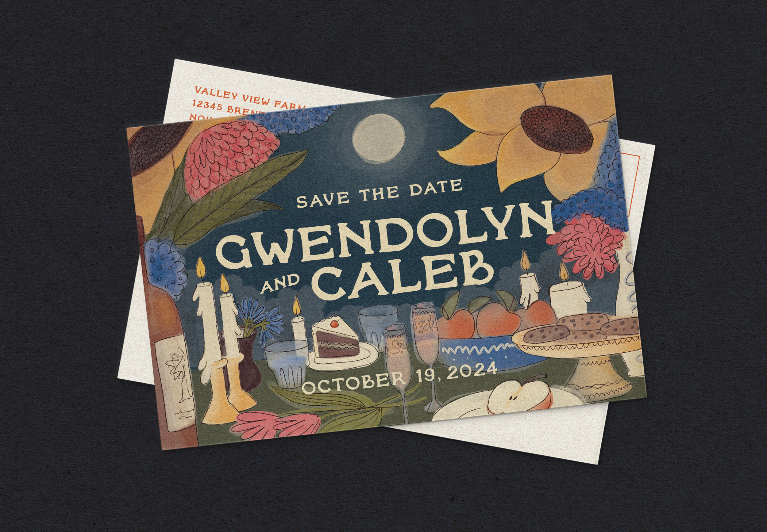
The Fletchers’ Illustrated Save the Date
The Brief
When Gwen called me in usual rush of excited thoughts, this time, about her wedding planning, I understood her idea almost instantly. Basically, she wanted to throw her own version of Bilbo Baggins’ 111th Birthday.
She used words like abundance, health, fullness, wholeness, and fertile. A potluck, under a full moon, autumn, an afternoon ceremony by the pond, dancing and feasting in the barn. Joy. Love.
The Inspiration
Gwen is one of my closest friends. We met in high school and both grew up in a rural part of Northern Virginia where we drove around, smoked cigarettes, and laid in grass for hours. Having moved to San Francisco, I can easily romanticize home, my memory drawn from feelings of ease and simplicity, especially when thinking of long summer days with Gwen.
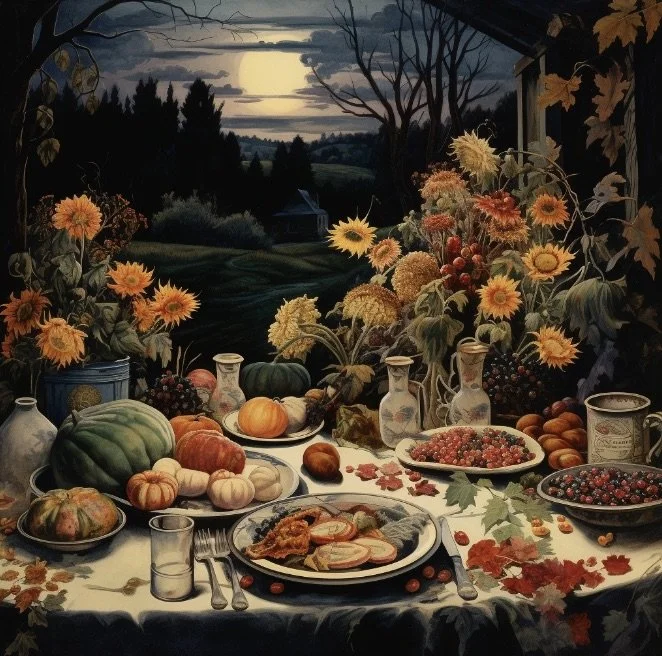
A visitor to this place now, it can feel like a nursery-tale, childhood distant in time and reality. The landscape of Virginia is similar to scenes in Winnie the Pooh and Peter Rabbit, capturing beauty and mischief of woods and farms with watercolor.


The Concept
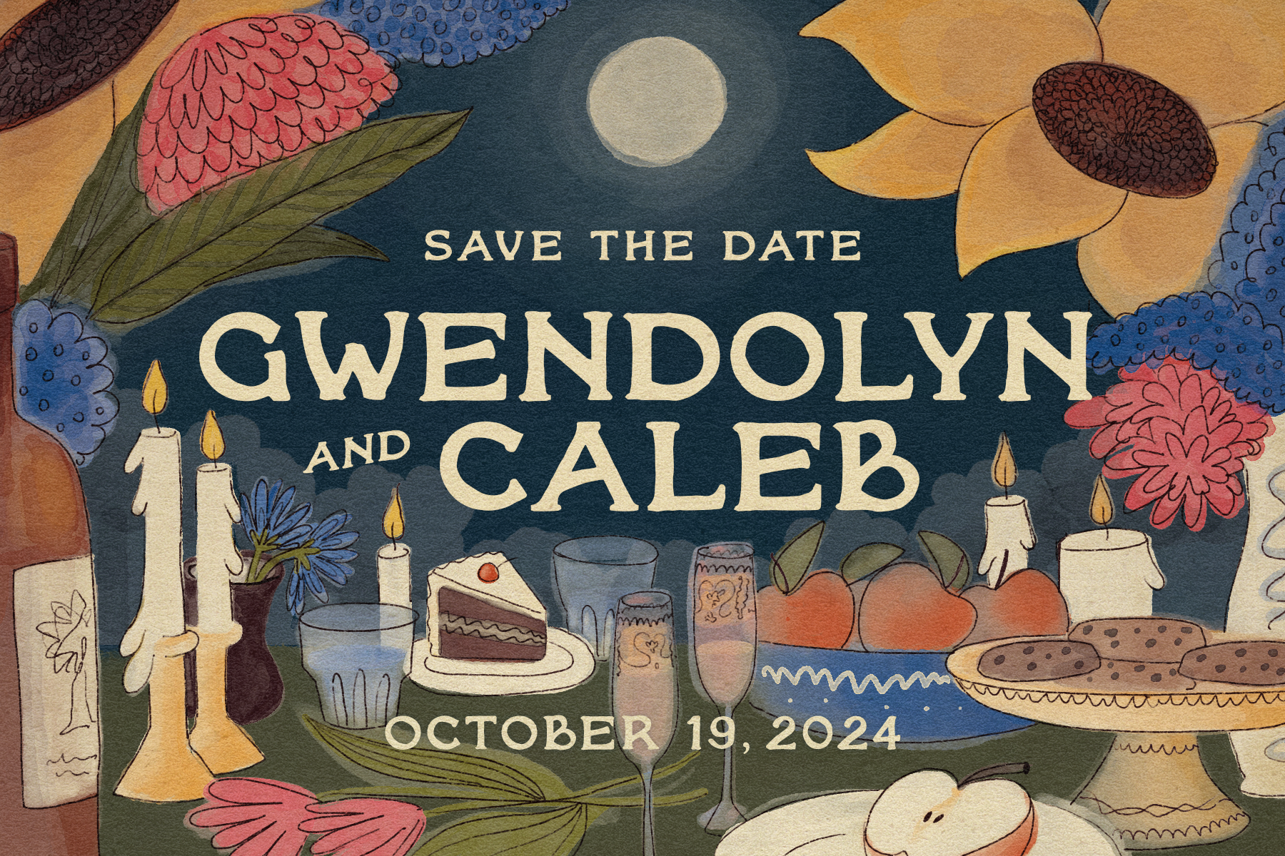
I knew I wanted to capture the feeling of being a guest at this joyful, warm, and intimate event. I thought of an end of the night scene with a messy table, remnants of food, forgotten glasses, tipsy and tired from the bounty and bliss.

The Colors
I wanted it to feel autumnal, but also not be too “on-the-nose” for an October wedding. An earthy, but vibrant pink and a warm navy brought depth and brightness for a celebratory feeling.

The Composition
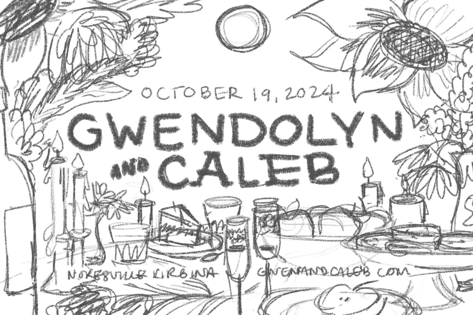
I first did a sketch in Procreate to test required design elements, meanwhile brainstorming Virginia farm-to-table foods and adding Gwen and Caleb’s easter egg table items (her grandmother’s antique champagne flutes and chocolate chip cookies).
The Execution
This was my first time using watercolor-style brushes, but it was fun to experiment with the layering and blending of colors. I wanted the line work to feel casual, like the lines gave significance to blobs of color. I think generally this worked, but my watercolor base could have been messier for this to be even more effective.


The font I chose is called Roony, I purchased it from a type designer based in Maui who specializes in handmade letterforms (see Taylor Penton). This concept required handmade letters for warmth and intimacy. I also added a card stock texture overlay.
I’m quite pleased with the result, but more importantly so were the bride and groom.